
You’ve been hearing about crypto trading lately and you’re ready to have your own share of the cake. But where do you start? To become a successful trader, you have to put in the work and study crypto trading extensively. One of the best ways to learn is to study the charts and look for chart patterns. As cheap as you may see this, it’s your first step to being a technical analyst.
In this post, we’ll teach you about some of the most common crypto chart patterns and how to use them to your advantage. We’ll also provide a cheat sheet that you can keep handy while you trade. So, without further ado, let’s get started.
What are Chart Patterns?
Chart patterns are visual representations of the price movement of crypto assets over a period of time. They can help you decide when to buy or sell and can be a great tool for forecasting future price movements including breakouts and reversals.
Chart patterns are present in different types of markets and they have helped traders for many decades. With adequate knowledge of crypto chart patterns, you will be able to apply them to other markets like the forex and stock markets.
There are a variety of chart patterns that you’ll see when trading cryptocurrencies. However, not all chart patterns are created equal. Some are more prevalent than others, and some are more likely to result in a successful trade prediction than others.
You’ll come across a lot of bullish and bearish trends in this article. A bullish trend happens when the market is moving upwards sharply while a bearish trend happens when the market is moving downwards sharply.

Triangle Chart Patterns
A triangle chart pattern is one of the most common chart formations that you’ll see in technical analysis. It occurs when the price of an asset is in a steady state and is bounded by two converging trend lines. The triangle chart pattern can be bullish or bearish, depending on which direction the price is moving. When the movement reaches the end of the triangle, it will continue in the same direction it was traveling before the triangle.
Ascending Triangle
An ascending triangle is a bullish chart pattern that indicates a strengthening uptrend. It is formed when the price creates rising higher lows at supports as a horizontal resistance line prevents it from rising any further. This creates a triangular shape on the chart, hence the name.
As long as the trend line stays intact, it’s a sign that the uptrend will continue and that a breakout is likely to happen at resistance soon.
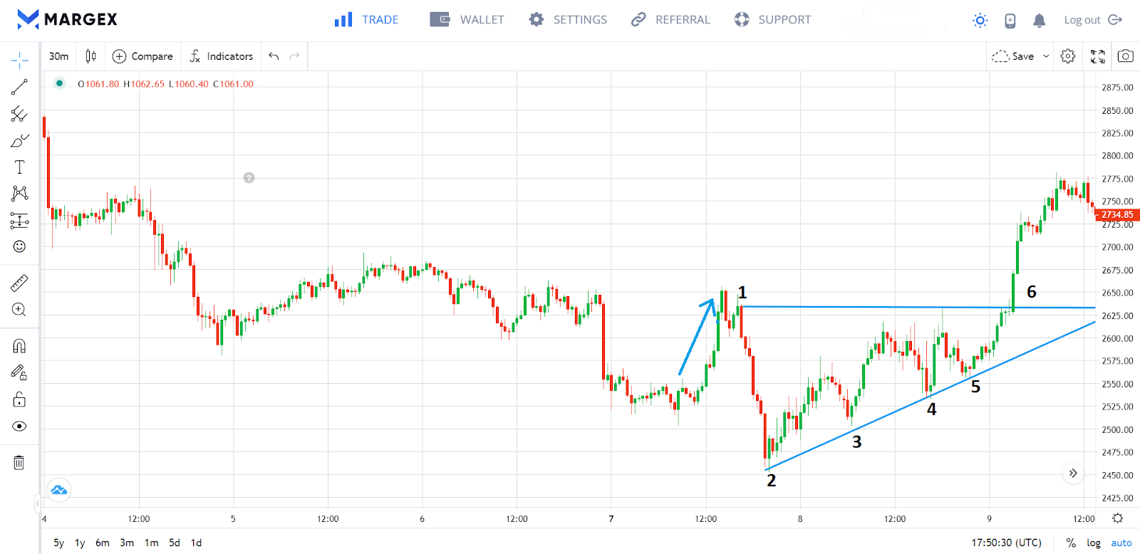
In the uptrend above, resistance emerges at 1 and the price retraces until support is formed at 2. After reaching resistance, we can then observe the price forming progressively higher lows at 3, 4, and 5 respectively. This pattern ends with a breakout at 6 and the uptrend resumes.
Descending Triangle
As the literal opposite of ascending triangle pattern, descending triangle patterns usually signals a bearish trend. It looks like a right triangle with the top horizontal line sloping downwards, and the prices tend to form lower highs and bounce off this line.
A descending triangle usually signals a breakdown in price, meaning the price will most likely breakout below the bottom line. It’s a fairly reliable indicator, so it’s worth keeping an eye on if you’re trading in a bearish market.
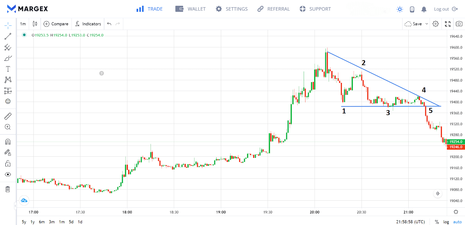
In the downtrend above, support appears at 1 and the price rises until it meets resistance and forms a lower high at 2. The support and another lower high are then observed at 3 and 4, respectively. This pattern ends with a breakout at 5 and the downtrend resumes.
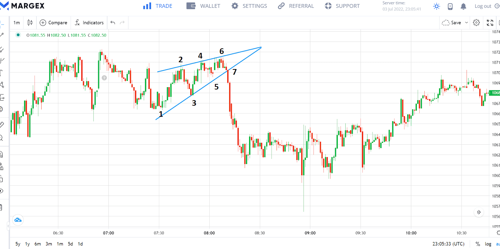
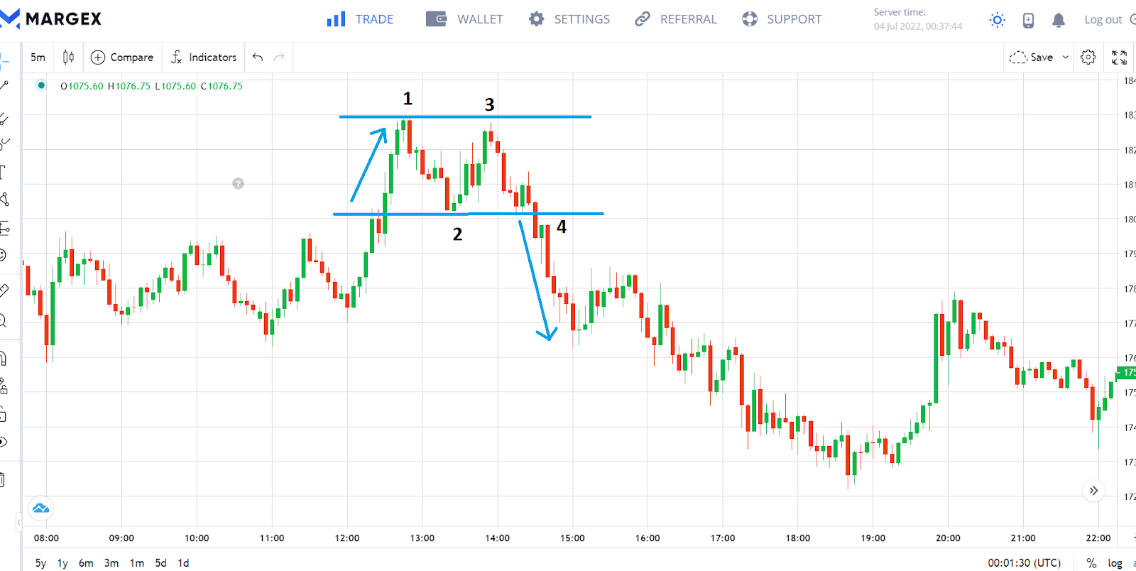
Bullish Symmetrical Triangle
The bullish symmetrical triangle is another type of triangular crypto chart pattern that predicts the continuation of a bullish trend. This pattern forms when two sloping trendlines intersect to form a triangle shape. The top trendline (resistance) is sloping down, while the bottom trendline (support) is sloping up. As the market nears the peak of the triangle, it will most likely break the resistance and resume its bullish trend.
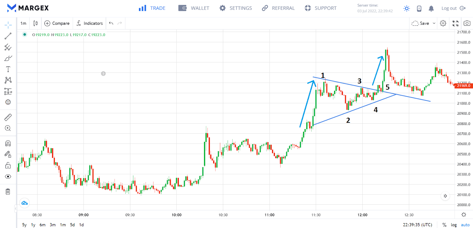
The uptrend above meets the highest resistance at 1 and the price retraces until the lowest support is formed at 2. We can then observe lower resistance and higher support points at 3 and 4 respectively. This pattern ends with a breakout at 5 and the uptrend resumes.
Bearish Symmetrical Triangle
The bearish symmetrical triangle also has the top trendline (resistance) sloping down, and the bottom trendline (support) sloping up. But unlike the bearish symmetrical triangle, the bearish symmetrical triangle occurs in a bearish trend and signals a continuation of the downward trend.
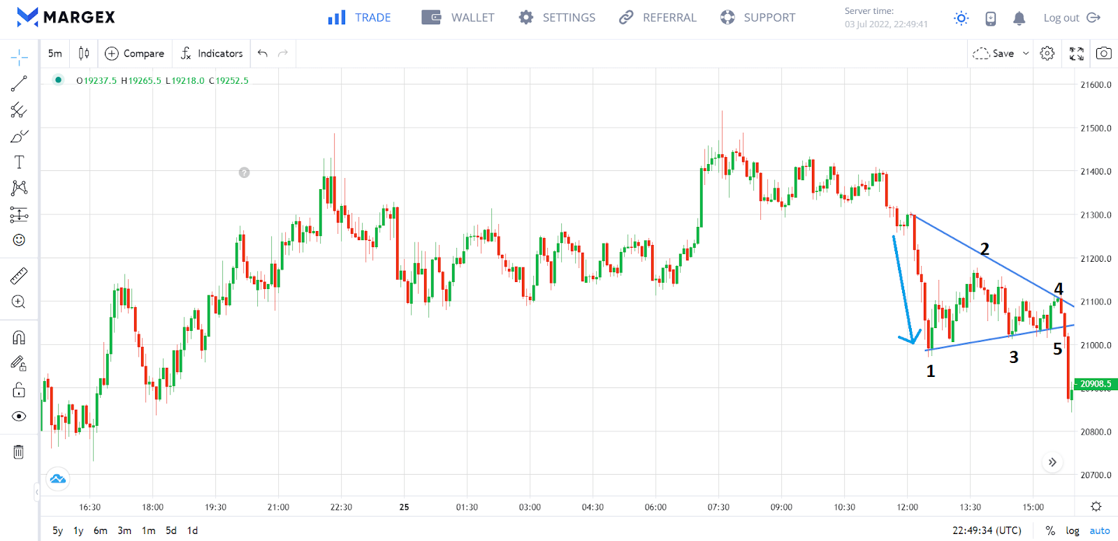
The downtrend above meets the lowest support at 1 and the price rises until the highest resistance is formed at 2. We can then observe higher support and lower resistance at 3 and 4 respectively. This pattern ends with a breakout at 5 and the downtrend resumes.
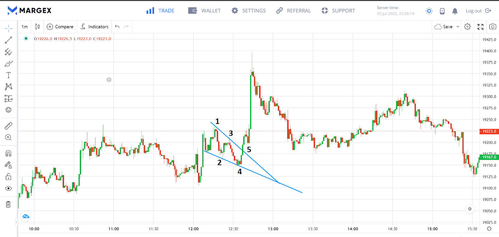
Rising Wedge
The rising wedge triangle is characterized by upper and lower non-parallel trend lines that converge as they move upwards. Traders can look forward to a bearish breakout as the price moves closer to its peak.
The downtrend above forms the lowest support at 1, and the price rises until resistance is formed at 2. We can then observe the market bouncing off higher supports and higher resistance at smaller intervals until there is a breakout at 7 and the downtrend resumes.
Falling Wedge
The falling wedge is the opposite of the rising wedge. It is defined by upper and lower trend lines that meet as they descend. It is a bullish signal that indicates the continuation of a bullish trend or reversal of a bearish trend.
The uptrend above meets the highest resistance at 1, and the price retraces until the formation of the highest support at 2. We can then observe the market bouncing off lower resistance and lower supports at smaller intervals until an uptrend emerges after the resistance breaks at 5.
Rectangle Chart Patterns
A rectangle chart pattern also consists of two horizontal trend lines, but unlike the triangle chart patterns, they are almost parallel to each other. The significance of this pattern is that it suggests a period of consolidation in a trend has occurred, and that a breakout is imminent. Traders should watch for buy and sell signals when the price breaks out of the rectangle.

Bullish Rectangle
The bullish rectangle indicates the continuation of an existing bullish trend. It forms when an upward trend encounters resistance and reverses to meet a support line that sends it back up. This sequence is repeated one or two times until a breakout happens at resistance. Both support and resistance levels are almost parallel, hence the name rectangle.
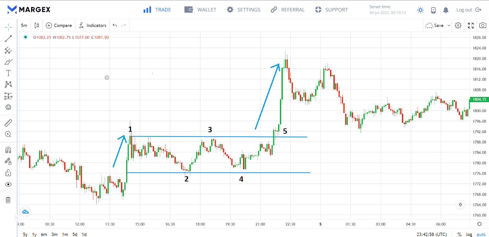
The uptrend above meets resistance at 1 which pushes the price down until support is formed at 2. It ascends to 3 to encounter the second resistance, which is at the same level as 1. It was pushed down again to 4 to create support at the same level as 2. A breakout happens at 5 and the uptrend resumes.
Bearish Rectangle
The bearish rectangle indicates the continuation of an ongoing bearish trend. It is formed when a downward trend bumps into a support level which sends it up. As the price moves up, it meets a resistance level which sends it back down. This sequence is repeated one or two times until a bearish breakout happens at support.
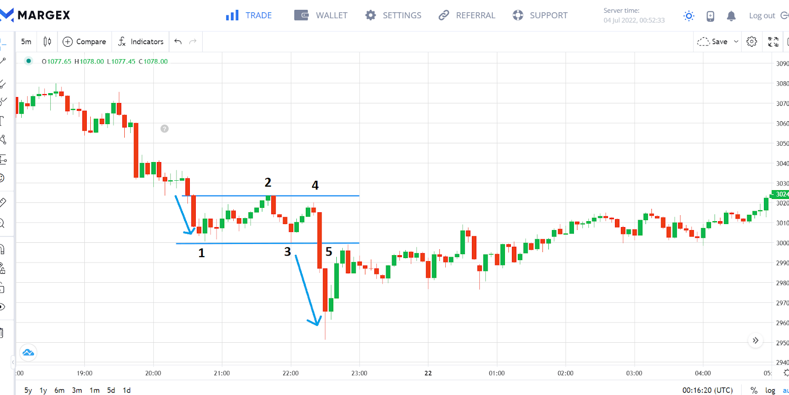
The above downtrend produces a little rectangle by first forming support at 1. It then ascends until it meets a resistance at 2 which sends it downward. This pattern is repeated through 3 and 4 until a bearish breakout emerges at 5.
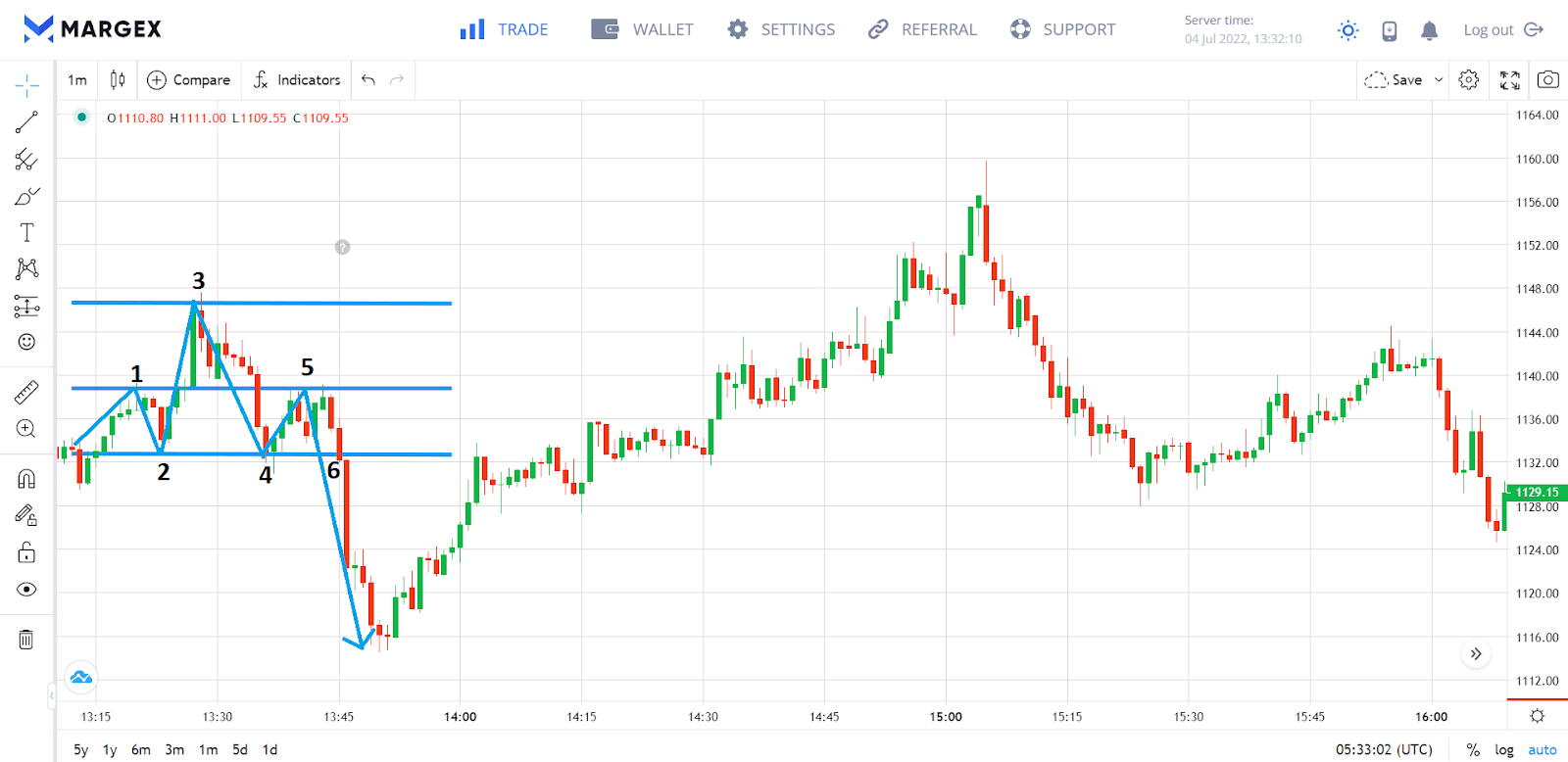
Double Top
A double top pattern is a reversal signal that happens when a traveling bullish trend forms a rectangular pattern that hits the top trend line (resistance) two times before breaking the bottom trend line (support) to form a bearish trend. Hence, the name “Double top.”
The uptrend produces a double top in the chart above by touching the resistance line twice at 1 and 3 and the support line once at 2 The reversal signal is completed after the support breaks at 4 and a downtrend is formed.
Double Bottom
This is the opposite of double top. It is a reversal signal that occurs when a traveling bearish trend forms a rectangular pattern that hits the bottom trend line (support) two times before breaking the top trend line (resistance) to form a bullish trend. Hence, the name “Double bottom.”
The downtrend in the chart above produces a double bottom by touching the support line twice at 1 and 3 and the resistance line once at 2. The reversal signal is completed after the resistance breaks at 4 and a supertrend emerges.
Triple Top
A triple top is a reversal pattern that occurs when an uptrend hits a resistance level and reverses to meet a support level. This sequence repeats itself two more times before breaking below the support to initiate a bearish trend.
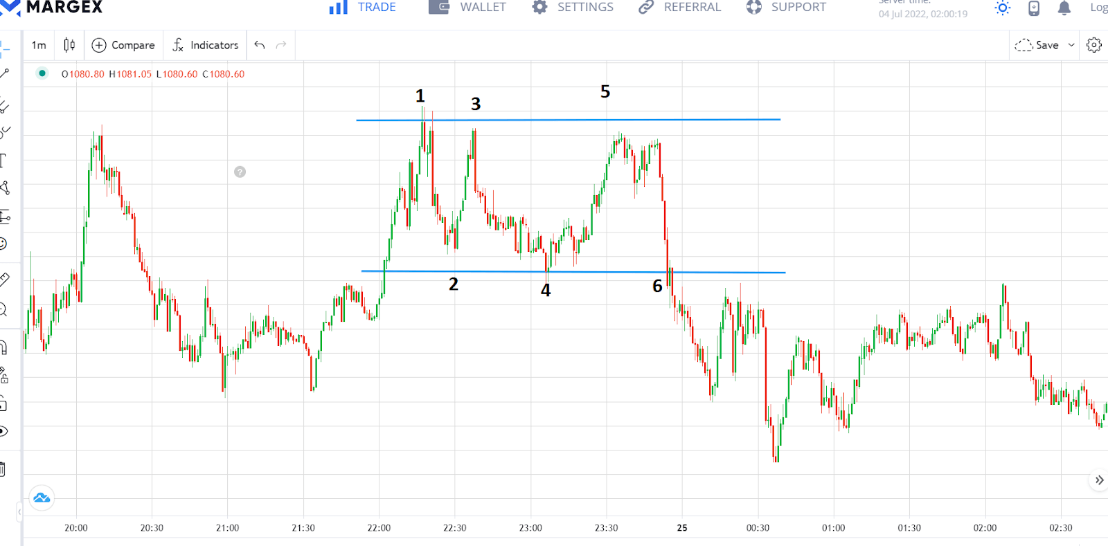
The uptrend in the chart above produces a triple top by touching the resistance line three times at 1, 3, and 5, and the support line twice at 2 and 4. The reverse signal is completed after the support breaks at 6 and a downtrend is formed.
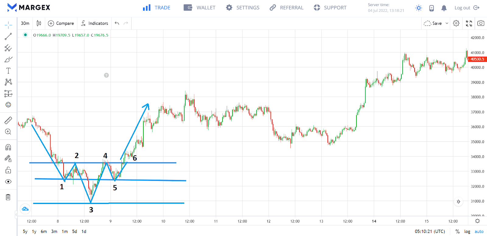
Triple Bottom
A triple bottom also happens when a downtrend reaches a support level and reverses back up to meet a resistance level. This sequence repeats itself two more times before breaking above the resistance to initiate a bullish trend. Triple patterns are less common than double patterns, but they produce better price reversals. They can also be harder to identify.
The downtrend in the chart above produces a triple bottom after touching the support three times at 1, 3, and 5. An initial resistance is produced at 2, followed by a lesser resistance at 4. The bullish signal is completed after the resistance is breached at 6 and an uptrend is established.
Pole Chart Patterns
A pole chart pattern is formed when the price makes a strong move in one direction, followed by a little consolidation in the opposite direction. This creates a shape on the chart that is often mistaken for a reversal pattern. However, a pole chart pattern is more often than not a sign that the crypto is going to continue its previous trend.
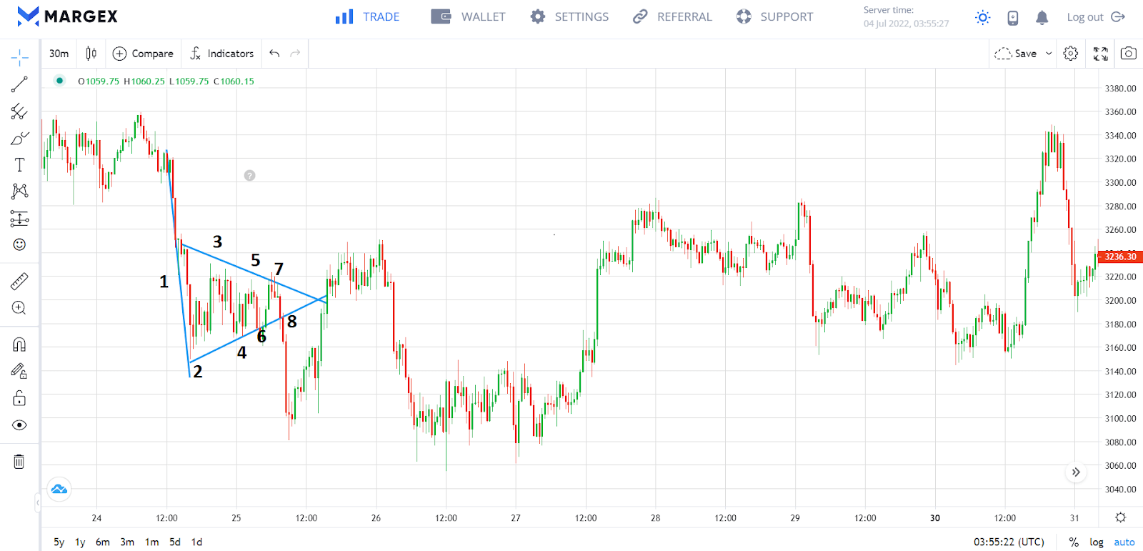
Bullish Flag
This pattern forms when a strong uptrend meets resistance to give rise to a short downward price consolidation period. A flag formation emerges as the price bounces between two trend lines sloping downwards. A breakout appears at resistance and the uptrend will resume.
The uptrend in the chart above meets its first resistance at 2. This causes the price to decline until a support forms at 3. A flag formation appears as the market bounces between increasingly lower resistance and support points. An uptrend is formed after breaking out of the flag formation at 8.
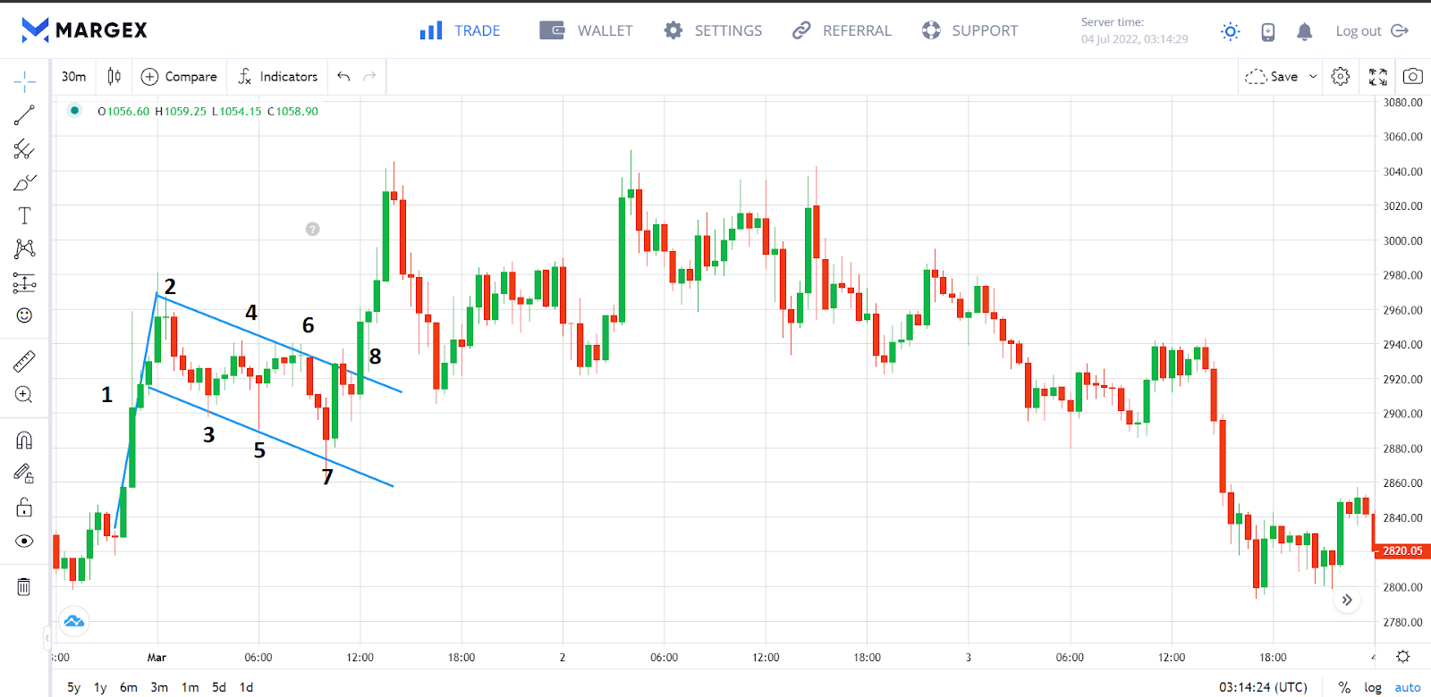
Bearish Flag
In order for a bearish flag to form, a strong downward trend must encounter support, resulting in brief upward price consolidation. After the brief consolidation, a breakout emerges and the downtrend continues.
The downtrend in the image above meets the first support at 2. This causes the price to rise until the first resistance is formed at 3. A flag formation appears as the market bounces between increasingly higher support and resistance points. The downtrend resumes after breaking out of the flag formation at 8.
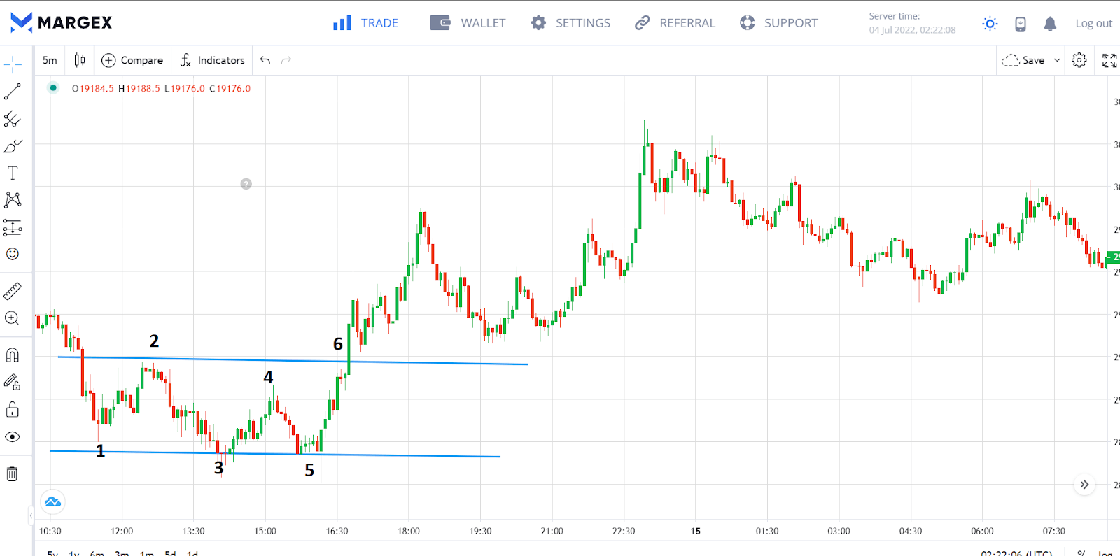
Bullish Pennant
Similar to the bullish flag, the bullish pennant happens when a strong uptrend meets resistance. However, as the price consolidation progresses, the retracements get smaller (shows fewer and fewer people are willing to sell) until a bullish breakout happens at the resistance.
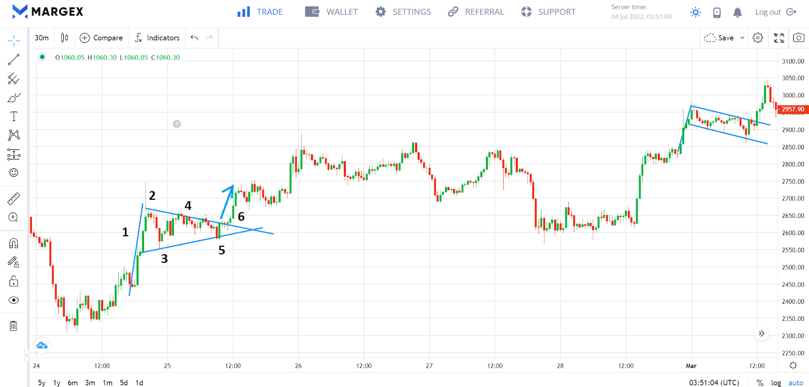
The uptrend in the chart above meets its first resistance at 2 which causes the price to decline until a support forms at 3. A pennant flag formation appears as the market bounces between increasingly lower resistance and increasingly higher support points. This shows that sellers are becoming less interested. An uptrend is formed after breaking out of the flag formation at 6.
Bearish Pennant
Similar to the bearish flag, the bearish pennant happens when a strong downtrend meets a support level. However, as the price consolidation progresses, the retracements get smaller until a bearish breakout happens at the support.
The downtrend in the chart above meets the first support at 2 which causes the price to rise until a resistance forms at 3. A pennant flag formation appears as the market bounces between increasingly lower resistance and increasingly higher support points. The pattern is completed after a bearish breakout of the flag formation at 8.
Other Crypto Chart Patterns You Should Know
Up to this point, we have discussed the most common kinds of crypto chart patterns and their variations. Now that we’ve covered some of the more common patterns, let’s move on to some of the less common ones. Adequate knowledge of these crypto chart patterns is important as they can be helpful for new crypto traders who are looking to predict market movement.
Head and Shoulders
The head and shoulders pattern is created when an uptrend develops three peaks: two lower peaks (the shoulders), and one higher peak (the head) in the middle. This is where the term “head and shoulders” comes from. When this pattern is confirmed, it signifies a change in the upward trend to a downward trend.
In the image above, the uptrend encounters resistance at 1 to produce the first shoulder’s peak. The price then reverses to a support at 2, before rebounding up to the resistance at 3 to form the head’s top. This reverses the price until it reaches the second support at 4. The second shoulder is formed when the resulting small uptrend encounters a resistance a 5 which is at the same level as 1. The pattern is completed when the price reverses and a bearish breakout emerges at 6.
Inverted Head and Shoulders
This is an inverted variation of the head and shoulders pattern. It is formed when a bearish trend develops three peaks facing downwards: two peaks (the shoulders), and one lower peak (the head) in the middle. When confirmed, it signifies a change in the downward trend to an upward trend.
In the chart above, the first shoulder’s peak is formed when the downtrend encounters support at 1. This pushes the price up to a resistance at 2, before falling again to the support at 3 to form the peak of the head. An uptrend is formed until it reaches the second resistance at 4. The second shoulder is formed when the resulting small downtrend bounces off 5 at the same level as the initial downtrend. The pattern is concluded when the price rises again and a bullish breakout occurs at 6.
Cup and Handle
This is a bullish continuation pattern that forms when the price falls after meeting a resistance level, finds support, and subsequently bounces off at increasing intervals to create a “cup” shape. It then rises to the resistance level and bounces through smaller support levels again to create the “handle” before resuming the uptrend.
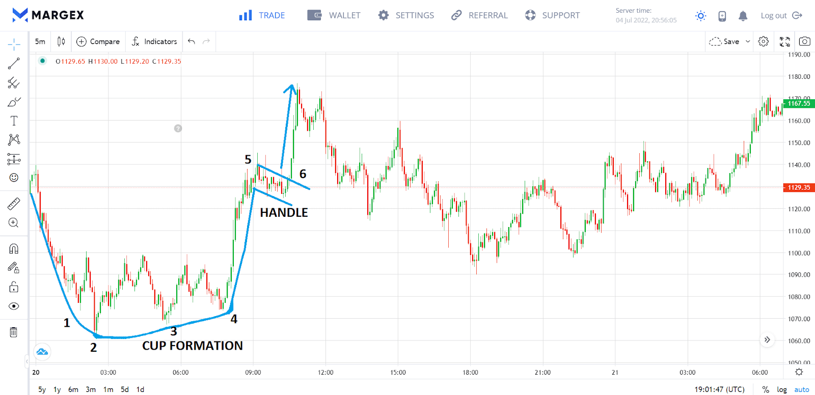
In the cup and handle pattern above, the bullish trend travels until it meets the first support at 1. The price continues to bounce around the support level until a “cup” shape is formed. Another small downtrend from 5 to 6 forms the handle. The pattern comes to conclusion with a bullish breakout at 6.
Inverted Cup and Handle
This is a bearish continuation pattern that forms when the price reverses after meeting a support level, finds resistance and subsequently bounces off at increasing intervals to create an inverted “cup” shape. Then it bounces through smaller resistance levels to create the “handle” before resuming the downtrend.
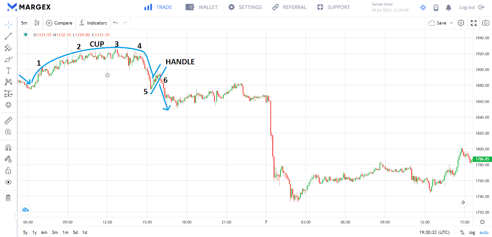
An inverted “cup” shape is formed in the chart above as the price bounces around resistance points from 1 to 5. A small uptrend from 5 to 6 forms the handle. The pattern comes to conclusion with a bearish breakout at 6.
Rounded Top
Similar to the inverted cup and handle, the rounded top has the shape of an inverted “U.” However, there is no handle. It indicates a change from an uptrend to a downtrend.
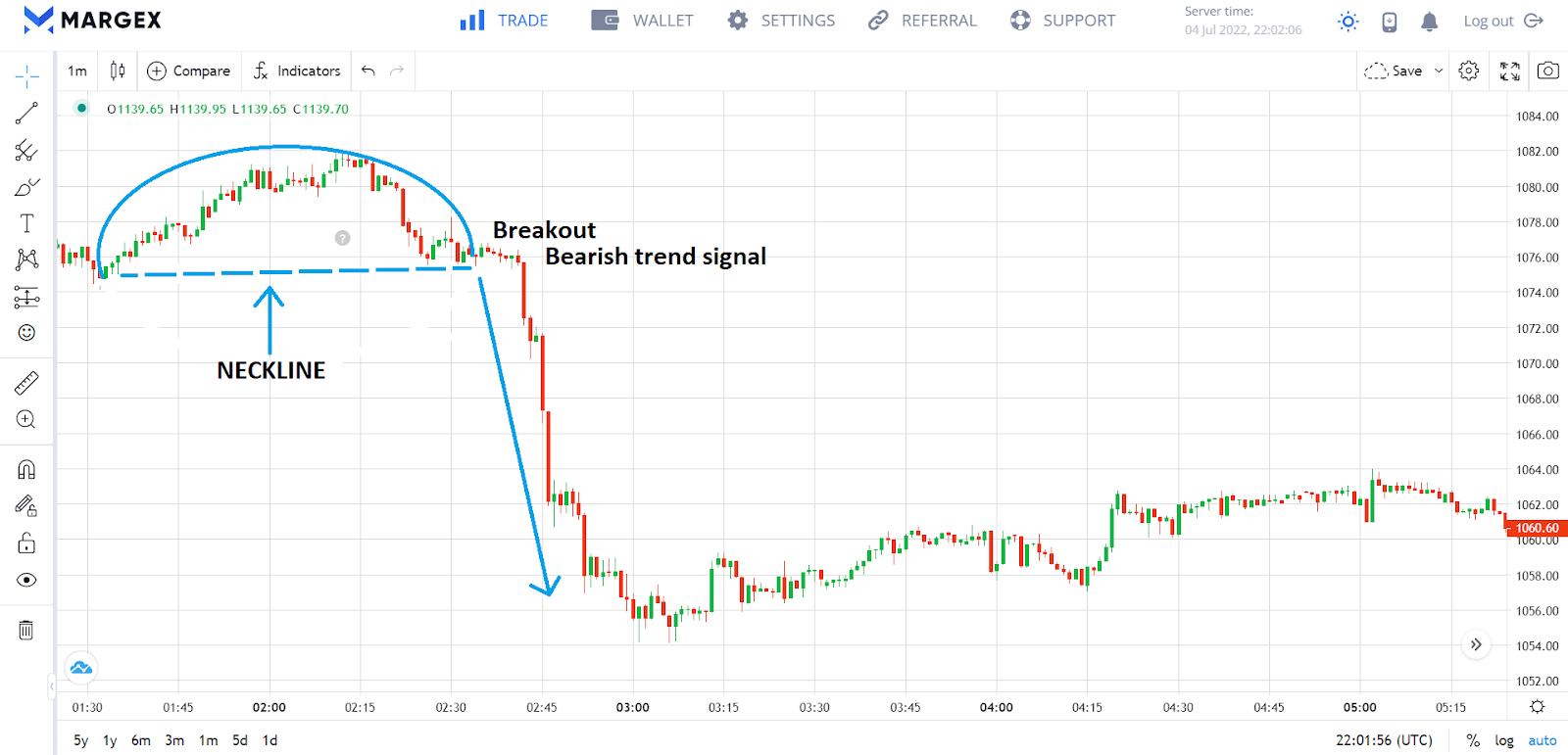
The pattern in the chart above forms a rounded top (inverted U shape) as the uptrend bounces around resistance points. The reversal is complete after a bearish breakout at the neckline.
Rounded Bottom
Similar to the cup and handle, the rounded bottom has an upright “U” shape. However, the handle is absent. Also referred to as a saucer pattern, the rounded bottom signals a reversal from a downtrend to an uptrend.
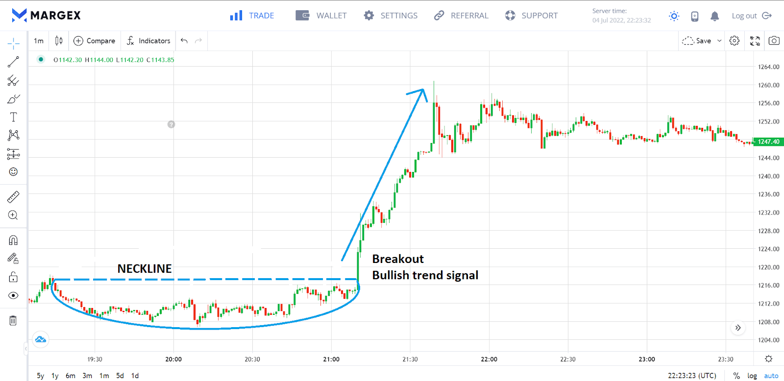
As the downward trend continues to retrace its steps toward support points, the pattern shown in the chart above develops into a rounded bottom (U shape). The reversal is complete after a bullish breakout at the neckline.
Failure Swing
Failure swings are formed when a market that has been in a strong uptrend or downtrend fails to achieve a new high or low. Failure swings are typically brief patterns that can be challenging to interpret because they often generate misleading signals.
Bearish failure swing
The formation of this reversal signal takes place when an uptrend is unable to achieve a new high that is higher than the previous one. This indicates that buyers are becoming tired and a downward trend is imminent.
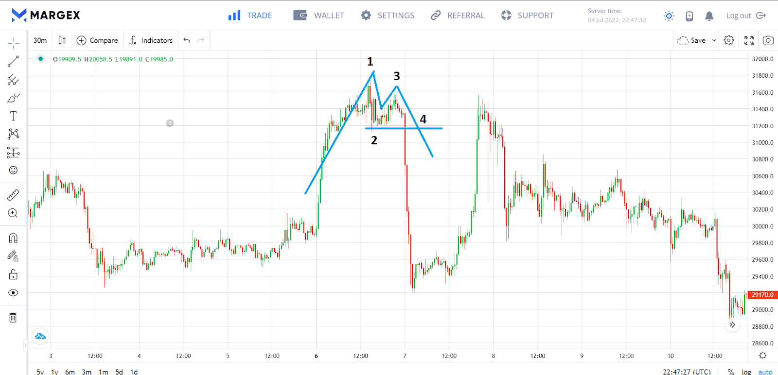
In the pattern depicted above, the uptrend encounters resistance at 1, which pushes the price downwards until support is reached at 2. This causes the price to rise to a new point of resistance at 3, which is at a lower high. Traders can now attempt to profit from this failure swing by selling when there is a breakout at 4.
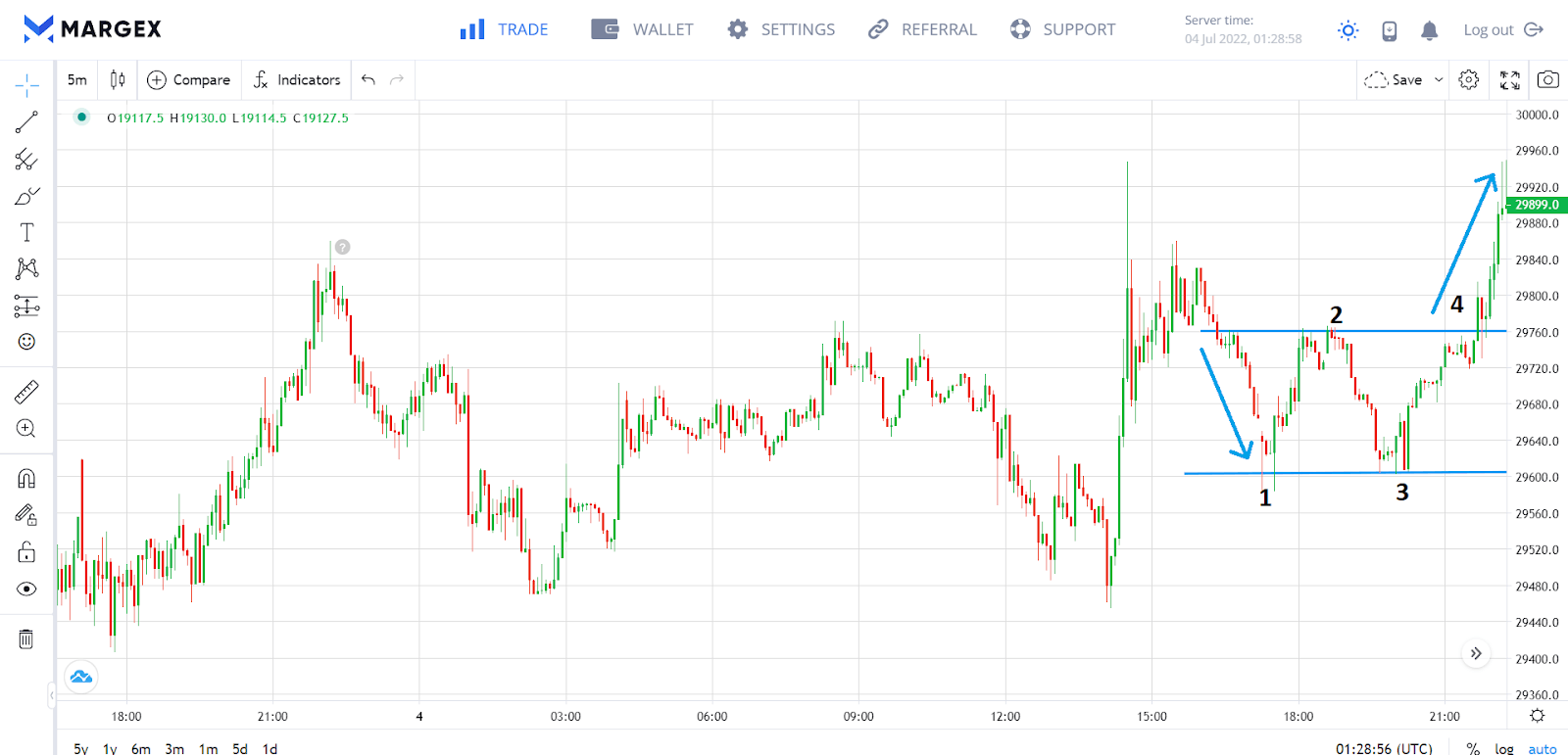
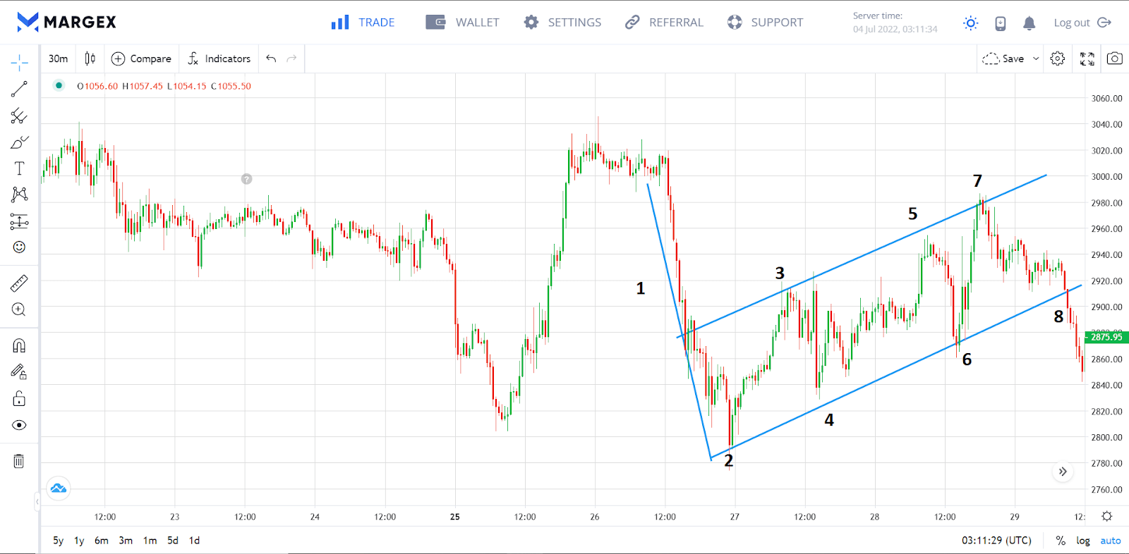
Bullish failure swing
The bullish failure swing is another reversal signal that occurs when a downtrend fails to reach a lower low than the previous one. This indicates that sellers are losing interest and an upward trend is about to happen.
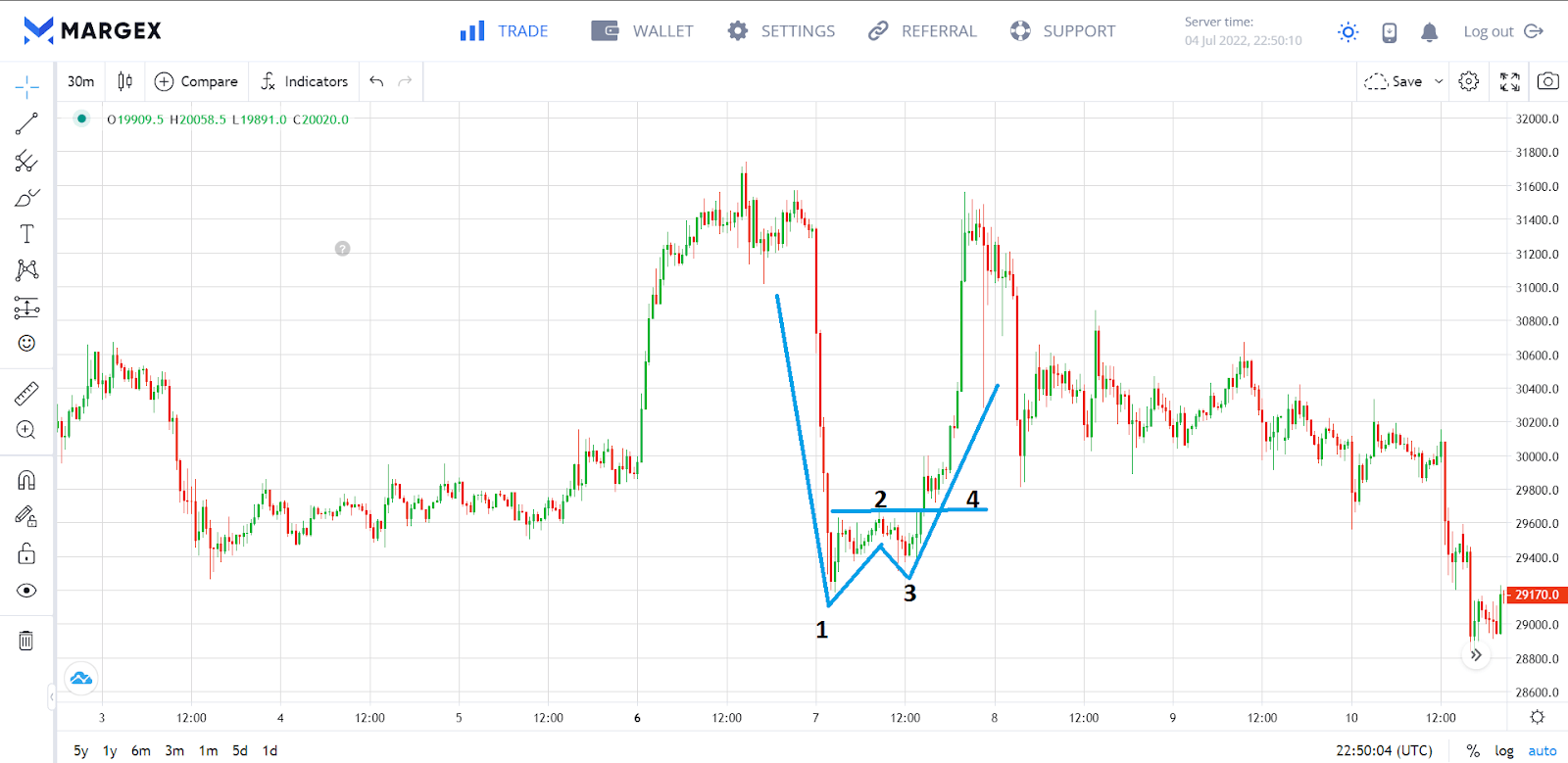
In the pattern depicted above, the downtrend encounters support at 1, which pushes the price upwards until the resistance at 2. This resistance causes the price to fall to new support at 3, which is at a higher low. Traders can now attempt to profit from this failure swing by buying when there is a breakout at 4.
How to trade crypto using Chart Patterns
You are now aware of what crypto chart patterns are and how to identify them; but how do you use this information to your advantage? The following are some pointers to consider when analyzing patterns:
- Use chart patterns to help you determine when to buy or sell cryptocurrencies. For example, if you see a double bottom forming, this might be a sign that it’s time to buy. Conversely, if you see a double top forming, this might be a sign that it’s time to sell.
- Look for chart patterns that have a track record of producing successful results. This will give you a better idea of what to expect and how to trade accordingly.
- Analyzing crypto chart patterns only is not enough. Use these patterns in conjunction with technical indicators, such as the Relative Strength Index, Moving Average, and the Volume-Weighted Average Price (VWAP).
Risk management
Trading cryptocurrencies can be very risky, particularly due to the volatile nature of the market. That is why traders, especially novice traders, are always recommended to maintain adequate risk management.
When it comes to technical analysis, remember that past performance is not an indication of future success. This means that just because a chart pattern has worked in the past doesn’t mean it will work in the future. In fact, there’s no guarantee that a chart pattern will work, as it might yield the opposite result. Therefore, you shouldn’t just jump into trades when a pattern is confirmed. Always wait for a clear breakout or confirmation before taking action.
The importance of stop-losses in crypto trading cannot be overstated. A stop-loss is an order that is automatically executed when a certain price is reached, protecting your capital from additional losses in the process.
FAQ
Do chart crypto patterns always work?
Traders have been relying on crypto chart patterns to assist them in predicting future price movements for decades now. However, they shouldn’t be your only analysis tool because as consistent as they are, they are not always 100 percent accurate.
Which chart is best for crypto trading?
When it comes to crypto trading, there are a variety of different chart types you can use to identify potential trading opportunities. The candlestick chart is the most popular chart type because it provides an excellent description of crypto chart patterns and the general market sentiment.
How do you read a crypto chart pattern?
Each pattern has a specific shape and meaning which helps you to make better trading decisions. To understand chart patterns, you need to take note of the shape being created by price movements in accordance with the steps outlined in this article.
Which technical analysis is best for cryptocurrency?
The best analysis is one specifically designed for the asset being traded. This is because most cryptocurrencies have a tendency to trend in one direction or another, making it feasible to create successful trades by spotting and riding these trends. A solid technical analysis is the use of chart patterns and effective indicators like the Moving Average Convergence Divergence (MACD) and Relative Strength Index (RSI).
How do you predict a crypto pump?
Riding crypto pumps generates a lot of profit. Look for chart patterns that are diverging from the norm and keep an eye out for reversal patterns from downtrend to an uptrend. Also, keep an eye out for bullish news events as it is common for crypto values to change in response to current events.


