
The first step in being a successful trader is learning to read and interpret chart patterns, candlestick patterns, and several other indicators. Keep in mind, however, that nothing can ever be promised. Two of the most valuable indications that can be seen on a trading chart are the Golden Cross and the Death Cross.
Whether your investment horizon is months or hours, these chart patterns may help you make more informed decisions. First, we’ll give you a high-level summary of the Golden Cross and Death Cross before we go further into them. Spotting a Golden Cross in a gloomy market indicates an upswing may be on the horizon.
The Death Cross, on the other hand, heralds the conclusion of a bull market. People may either short the need to make a profit or abandon ship to save their own lives. Remember that these are only assumptions based on assumptions and that no guarantees can be made. Numerous false signals of the Golden Cross and the Death Cross have been recorded throughout history.
What Is A Moving Average?
The moving average is a stock indicator often used in technical analysis to establish a continuously updated average price. Knowledge of the golden cross and the death cross requires a solid understanding of the moving average (MA). MAs are generally computed to establish an asset’s trend direction or to identify its support and resistance levels.
The moving average (MA) is a technical indicator that refers to the average price of a particular asset over a specified period. MAs reflect whether the investment is trending bullishly (positively, upwards) or bearishly (negatively, downwardly). When trading bitcoin charts in real-time, MAs give essential indications. They may also be set to other time intervals, such as 10, 20, 50, 100, or 200 days. Such times accentuate market tendencies, making them easy to see. Traders also use several forms of MAs. The first is the simple moving average (SMA), which divides the average price of an asset during specific time periods by the total number of periods.
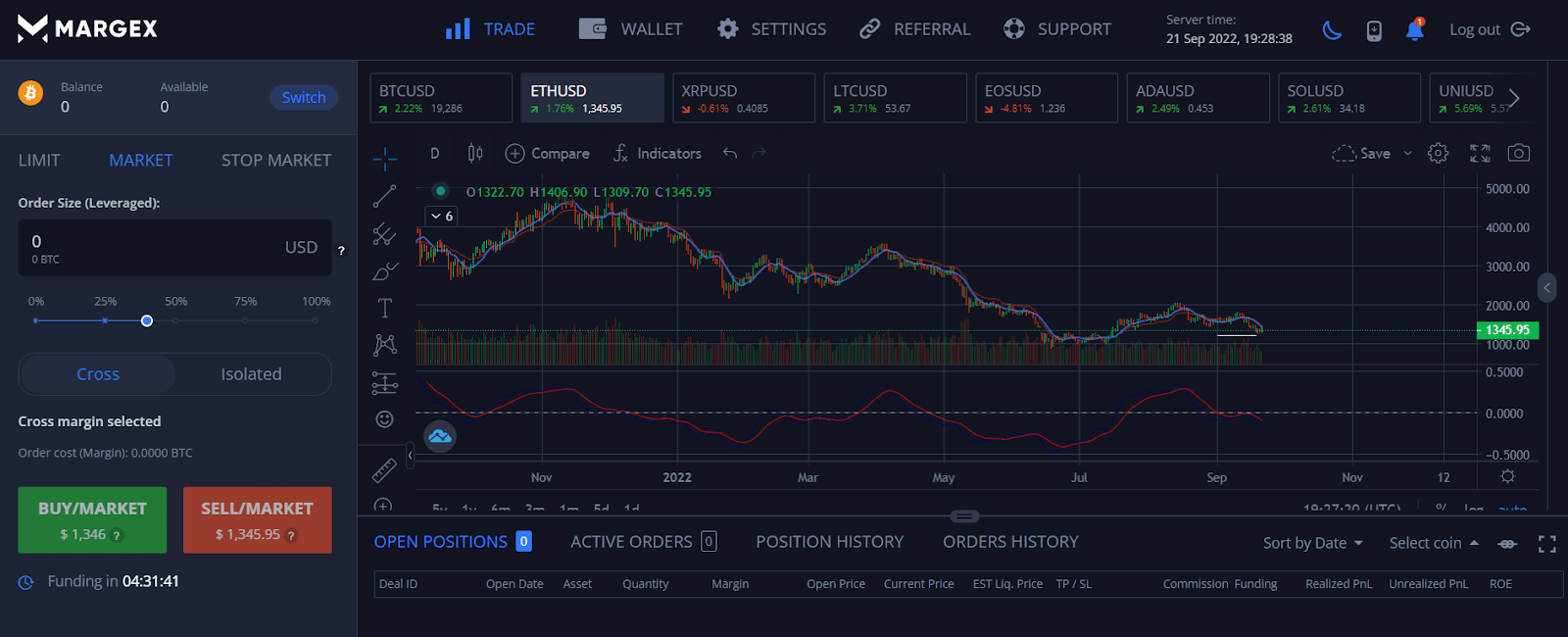
An illustration of Ethereum’s daily chart showing the moving average indicator on the Margex platform
Another option is the weighted moving average, which, as the name implies, gives more weight to recent prices. This makes the value more representative of current market movements. While an exponential moving average gives greater weight to recent prices, it does not maintain consistency with the rate of decline between a specific price and the price preceding it. Moving averages, sometimes known as “lagging indicators,” are calculated using past prices. Traders use MAs as indications to help them purchase and sell assets, with the 50-day and 200-day periods being the most actively observed by crypto traders.
Golden Cross Explained
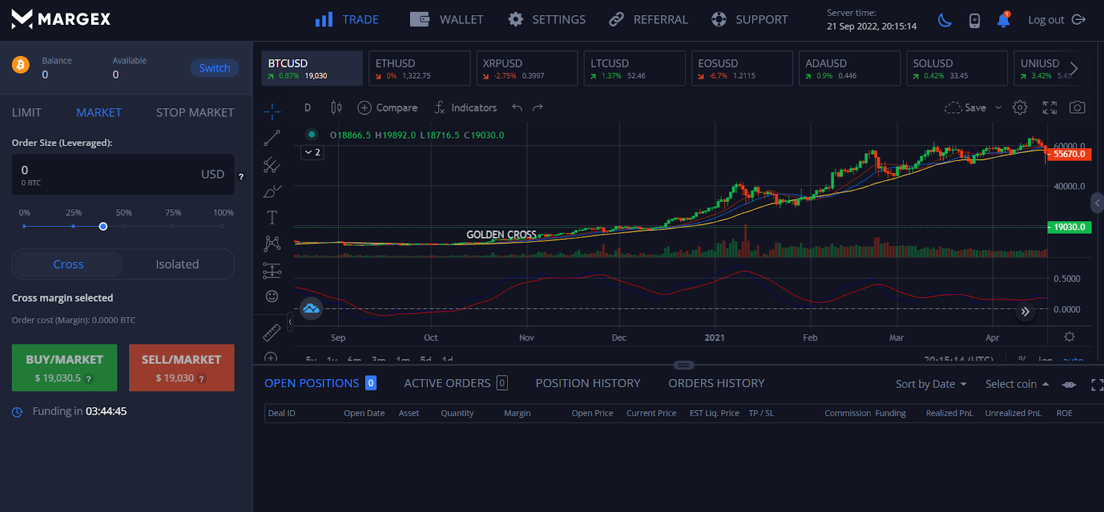
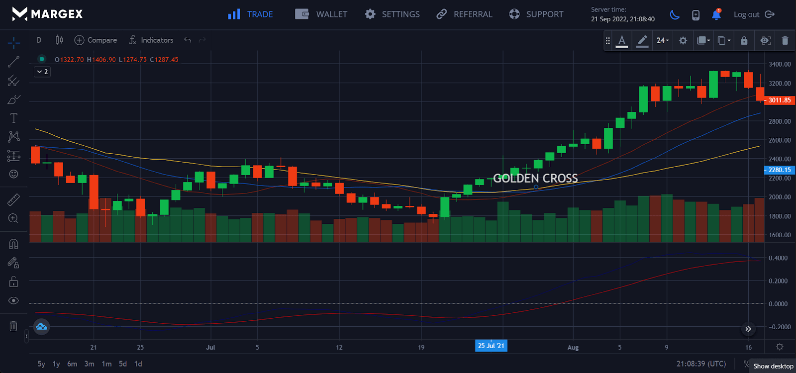
A “golden cross” happens when a short-term moving average and a big, long-term moving average cross over to the upside. A golden cross indicates a price increase and a market upturn.
The short-term moving average rises quicker than the long-term moving average until market circumstances force them to cross. Golden crosses in simple moving averages occur when the 50-day SMA crosses above the 200-day SMA, suggesting a clear uptrend.
A golden cross configuration usually consists of three stages. First, when selling is exhausted, it typically signals the conclusion of a decline and, as a result, the start of a golden cross. The next stage occurs when the short-term MA crosses the long-term MA. The last step is rapidly followed by a continued rise, typically leading to more incredible prices. Although no two golden crosses are alike, these three steps are often the specific events that identify the appearance of a golden cross. Let’s take a closer look at each step.
Buyers take control of a downturn during the first stage. A short-term drop in the 50-day moving average indicates the start of a golden cross. This is because the subsequent strength often results from buyers taking control just as short-term sellers begin to dry up.
On the chart, there is a levelling off, with buyers driving up prices in an attempt to acquire control. The ensuing momentum progressively drives the 50-day moving average past the 200-day moving average, at which time the two periods cross. When the 50-day moving average reaches the 200-day moving average, traders often go on high alert to assess if an uptrend is happening or whether it’s merely a false alarm. The last step occurs when the 50-day moving average continues to push higher, signalling its momentum. This, too, usually leads to overbuying, although in brief spurts.
Death Cross Explained
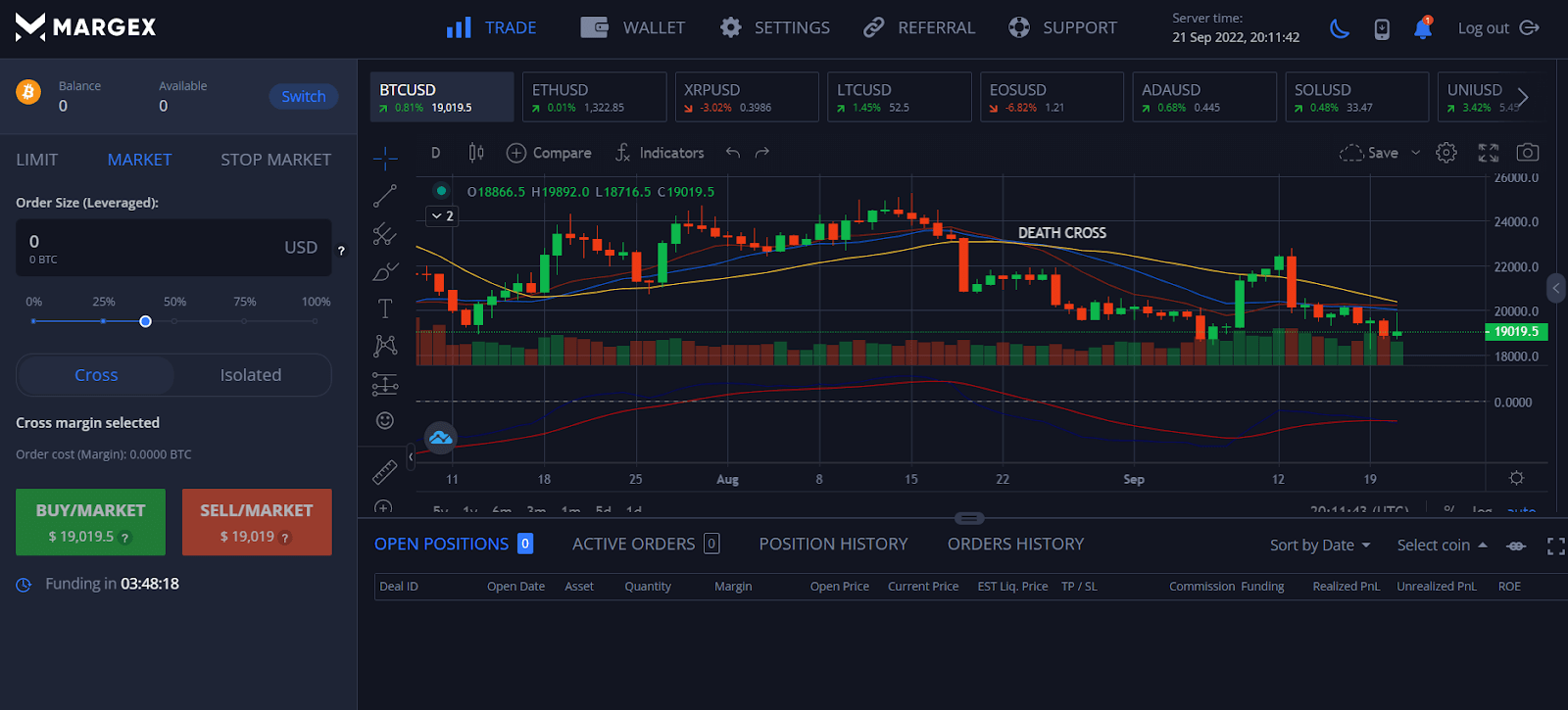
Unlike a golden cross, a death cross features a downward MA crossing. This indicates a decisive market slump when the short-term MA moves downward and crosses the long-term MA.
Described, it is the inverse of the golden cross. A death cross is often seen as a negative indication. When the 50-day moving average exceeds the 200-day moving average, it indicates a downtrend. A death cross has three stages. The first happens during an upswing when the short-term moving average remains above the long-term moving average. The second phase is distinguished by a reversal in which the short-term MA falls below the long-term MA. This is followed by the beginning of a downtrend as the short-term MA continues to fall, remaining below the long-term MA.
Death crosses, like golden crosses, are unique, yet particular signs indicate their presence. Here’s a closer look at each step of a death cross. Typically, the first stage of a death cross is characterized by an asset being in an uptrend. This is followed by a decreasing 50-day moving average, the first warning that bearishness is on the way. The short-term MA diverges from the long-term MA when prices begin to decrease after they have peaked.
The 50-day moving average crosses below the 200-day moving average in the second stage. This is an important point since it indicates that the asset may be undergoing a decline. As prices continue to decrease, the disparity between the two moving averages becomes increasingly evident. During this stage, the death cross suggests and starts to develop considerably more vividly. The last stage is defined by the 50-day MA continuing to trend lower, remaining below the 200-day MA. This indicates that a downturn has begun. Traders often liquidate their holdings, expecting more market drops when the death cross occurs. However, if the downtrend is not prolonged, it might indicate a short-lived momentum with prices soon rising, in which case the death cross is regarded as a misleading indicator.
Death Cross Vs. Golden Cross: Differences
The primary distinction between a golden cross and a death cross is that the former suggests an upward trend while the latter shows a downward trend.
High trade volume is evidence for both of these. When analysing the background of a crossing, certain technical analysts may additionally look at other technical signs. The Moving Average Convergence Divergence (MACD) and the Relative Strength Index are widely used indicators (RSI).
Consider, too, that moving averages are always behind the curve and can never be used as a predictor. This indicates that the combination of the two crosses usually indicates a completed trend reversal rather than a reversal in progress.
As previously stated, the two are opposites regarding how they look on the chart and what they indicate. Because MAs are lagging indicators, both crossings confirm the occurrence of a trend reversal rather than anticipate it. They should be combined with other technical indicators to provide a complete picture of market circumstances. High trade volume is generally used to corroborate the golden and death crosses. Moving average convergence divergence and the relative strength index are two technical indicators that analysts may consider.
Death crosses are used to herald the start of a long-term bear market, not only in cryptocurrency but also in financial markets. In the past, the death cross signaled the onset of severe economic catastrophes, such as the 1929 Black Monday stock market disaster and the 2008 financial crisis. However, death crosses might suggest erroneous signs and are not always correct. For example, there have been examples of markets rebounding following a death cross.
On the other hand, golden crosses indicate the advent of a long-term bullish market. However, despite its apparent ability to anticipate prior massive bull runs, golden crosses may provide misleading signals.
Examples Of Golden Cross And Death Cross
To further comprehend the idea, consider the following golden cross and death cross examples:
Golden cross example
Take a look at the 1-day chart of hypothetical stock ‘ABC.’ The yellow line in the graphic represents the 50-day moving average. The red line shows the 200-day moving average. The cross formed by the yellow line cutting the red line from below is known as the golden cross.
Death cross example
It prompted headlines portraying “a stock market in shambles.” The index fell 11% over the following two weeks and a day. The S&P recovered 19% from that low in two months and was 11% higher at the time of the death cross less than six months later. During the first COVID-19 panic in March 2020, another S&P 500 death cross occurred, and the S & P 500 went on to gain well over 50% the following year.
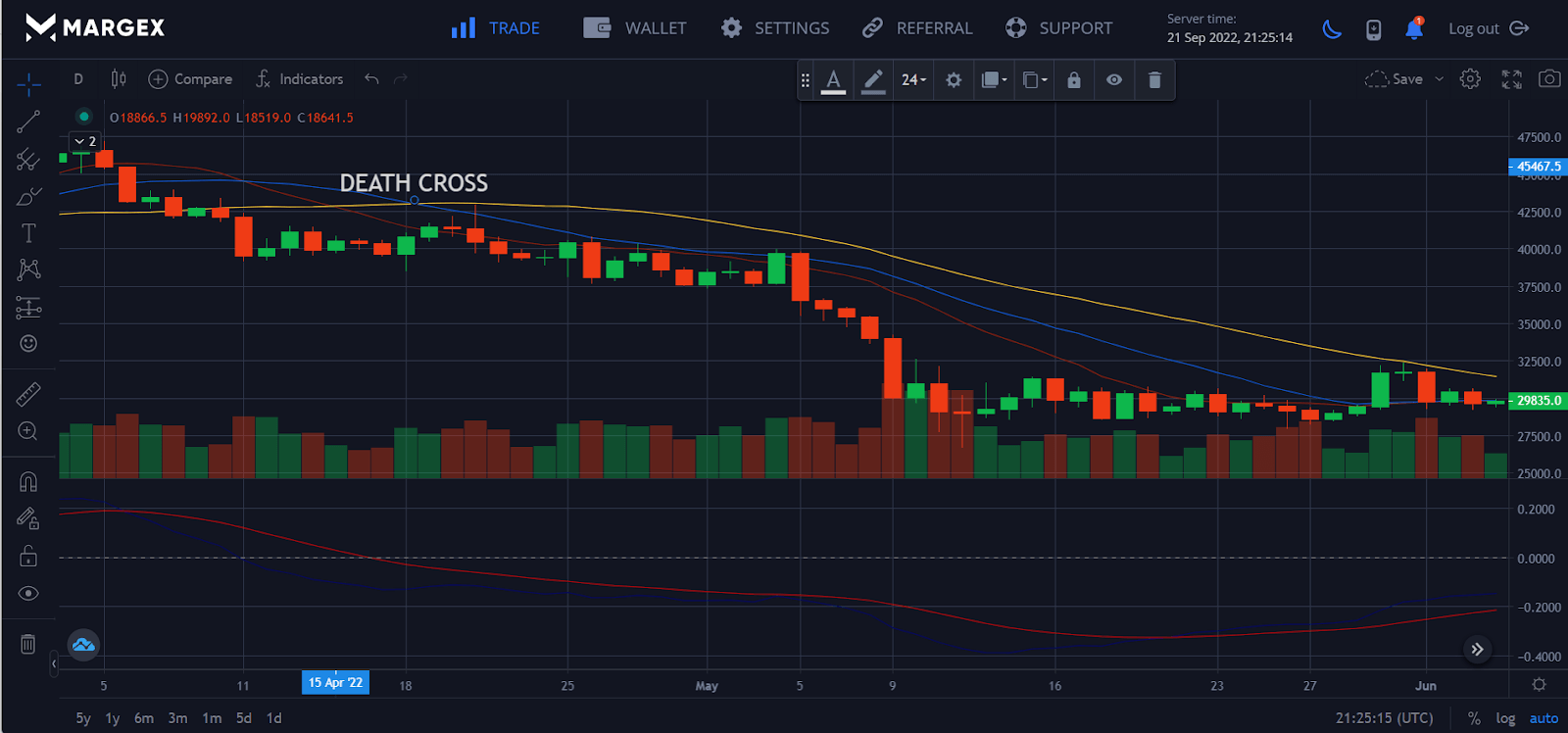
Of course, these instances do not reflect the whole variety of possible consequences after a death cross. They are, nevertheless, more reflective of current market circumstances than previous death cross events.
How Can Crypto Traders Use The Golden Cross And Death Cross In Their Trading Strategies?
Traders often purchase at the golden cross and sell at the death cross.
Different traders will handle bullish and bearish crossover indications in different ways. Before joining or quitting a transaction, some traders may wait for a verified golden cross or death cross. Others may use the crosses in combination with other technical indicators as confirmation signals.
However, in general, the golden cross and death cross may be employed as trend-reversal indicators. For example, if a trader notices a golden cross developing, they may purchase an asset in anticipation of a price increase. Similarly, if a trader sees a death cross developing, they may sell an asset in expectation of a price drop.
Of course, it is always prudent to use care when trading crossover contexts since following them blindly may result in losses. Moreover, as previously said, false signals arise, and it is critical to check any crossing indication with other technical indicators before entering a trade.
Seasoned traders also understand the importance of looking at the larger picture and considering different readings. For example, a golden cross may occur on an hourly time frame basis, but zooming out to look at the daily or weekly time frame may reveal that a death cross is in play.
Trading volume should also be monitored while trading crossover signals since volume surges may confirm or refute the integrity of a signal.
Conclusion
Technical analysis, including the usage of golden crosses and death crosses, is used by traders. A bull market is indicated by a golden cross, and a bear market by a death cross. Both are established when a minor long-term moving average (SMA) confirms an existing long-term trend by crossing over a shorter-term SMA (SMA). Both crosses are useful for investors, especially for determining when to begin and quit a transaction.
FAQs
How do you calculate a golden cross?
Learning about moving averages is the first step in grasping the concept of a golden cross. To calculate an average, a moving average uses the stock price at the end of each trading day over a specified period (for example, the last 50 trading days). Then, it divides the result by the same number of days.
Is a death cross a good time to buy?
A bearish market or asset drop is indicated by a death cross, which might be a perfect moment to purchase. Conversely, many investors buy assets at bargain prices because they believe their values will rise again in the not-too-distant future.
What timeframe is best for a golden cross?
Some analysts describe it as a crossing of the 100-day moving average by the 50-day moving average, but others define it as a crossover of the 200-day moving average by the 50-day moving average. Essentially, until they cross, the short-term average rises faster than the long-term average.
Is the golden cross a good indicator?
When a security’s short-term price moving average surpasses its long-term moving average, the golden cross, a positive momentum indicator, happens. The opposite of the idea discussed is a death cross, which occurs when the short-term price’s moving average drops below the long-term moving average. Utilising a variety of trade circumstances following the crossover raises the chance of successful trading.
Is a golden cross a bullish signal or a bearish signal?
A bullish breakout pattern generated by a crossover involving a security’s short-term moving average (such as the 15-day moving average) breaking above its long-term moving average (such as the 50-day moving average) or resistance level is known as a golden cross.


