The crypto space has evolved over the years from holding Bitcoin (BTC) and Ethereum (ETH) to trading these crypto assets on a decentralized exchange to make more money.
Most crypto traders who have spent a significant amount of time in the crypto market begin to understand how powerful it can be to harness technical analysis skills, whether intraday or long-term trading, as price movements and volatility, can quickly go against you.
Acquiring the skill of a technical analyst for the financial market, as well as a thorough understanding of various strategies, such as bullish chart patterns, to increase profitability.
For example, the price of Bitcoin increased from $30,000 to $69,000 in November 2021. BTC formed a head and shoulders pattern, indicating that the price was declining. Since then, we've seen a steady decline from that level to where Bitcoin trades at $20,000.
The Bitcoin chart has since shown a massive drop of over 70% from its all-time high, suggesting the need to acquire the skills of technical analysis tools, strategies, and Indicators to best forecast the price movements of these assets for better and more efficient return on investment (ROI).
Some technical analysis tools include bullish chart patterns and indicators such as the Relative Strength Index (RSI) for better profitability.
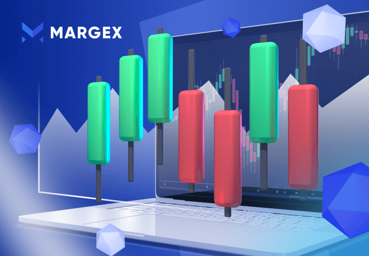
Bullish chart patterns are technical analysis strategies most traders use in crypto, forex, and stock markets to best time their entries, exits, and trend directions based on the timeframe and the type of trader.
This guide focuses on bullish chart patterns, how to spot different bullish chart patterns to be used in your trading setups, how to time your entries and exits, and how to improve your chances of higher profit success by trading when you spot a clear bullish pattern.
What Are Bullish Chart Patterns?
Chart patterns have come a long way as they are the foundational building blocks of technical analysis; they have been spotted repeatedly in the market as the market usually moves in trends. These patterns are simple and can be easily seen by different traders, be it swing traders, scalpers, long-term traders, positional, and investors. There are different chart patterns, but for this article, we would focus more on bullish patterns to help traders spot bullish trends and continuations as prices go higher.
Chart patterns can be used to project price movement and help traders to ascertain targets, entries, and possible exits in the market. With the help of chart patterns, the risk-reward ratio (R: R) calculation becomes easy.
Bullish chart patterns are trend continuation patterns that help traders to trade in an upward direction as prices continue to trend higher.
Let us focus on the more common bullish chart patterns traders can explore to increase trading profitability.
Bull Flag
A bullish flag is a continuation pattern with strong uptrend momentum; because the pattern looks like a flag, most traders call this pattern a bull flag. The bull flag can be a horizontal rectangle or a tilted rectangle.
Usually on break out of this bull flag by buyers or bulls result in the price moving with a strong uptrend to new heights.
A bull flag is formed due to a momentary pullback from sell orders creating a parallel upper and lower trendline called the flag. This ends the initial rally as the price tends to consolidate in this region, forming a bull flag.
During this consolidation phase, traders need to be prepared to take immediate action as the price breaks out of this channel with a strong uptrend movement to new highs, as this shows bulls or buyers are now in control of price movements.
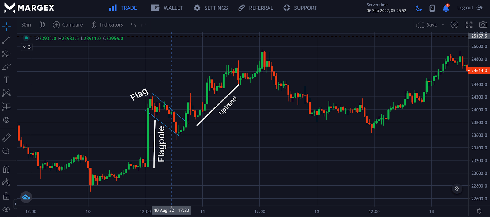
From the image, the bull flag is made up of support and resistance; on a clear breakout of the minor consolidation, the price moved high with a strong uptrend movement showing bulls are in control. Moreover trading this patterns can be tough, Margex provides a unique feature to trade while you stake at the same time with this assets.
Double bottom
This reversal occurs when a crypto pair has experienced a downward price movement. This allows buyers or bulls to buy or go long on assets as this reversal comes with great price movement to the upside.
The double bottom pattern is formed by two points on the horizontal price level known as the support level signifying a high potential price reversal to the upside.
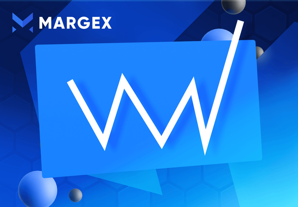
The double bottom pattern is usually formed at the end of a downward trend with what looks like “W” as sellers cannot push prices lower, buyers take control as sellers give up, and prices bounce back from this key area of demand, confirming a bullish trend reversal.
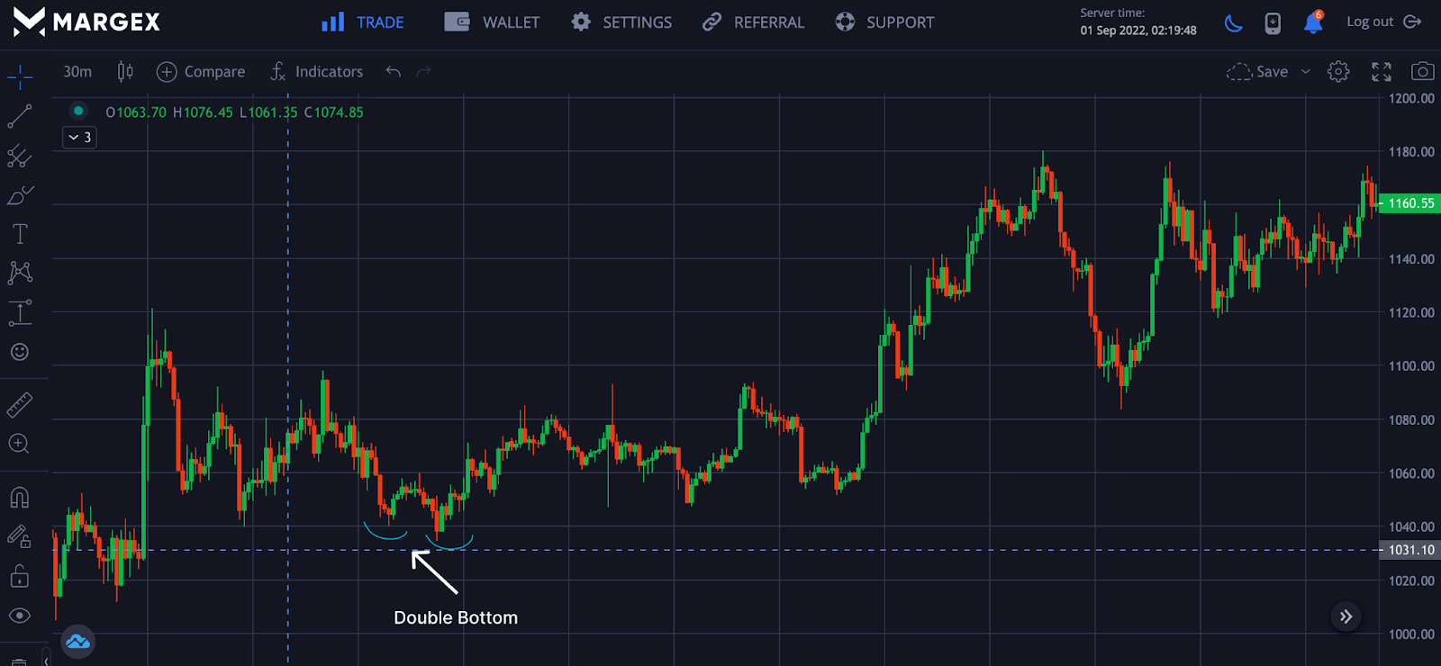
The image shows double bottom formed as prices drop to a key region called the support; buyers were able to overcome sellers as this support zone is seen as an area of demand for prices. The price of ETHUSD bounced off this area with a bullish trend reversal as the price rallied to a new high.
Rounding bottom
The rounding bottom pattern is another bullish price pattern used in technical analysis by traders to time the end of a potential downward trend. This rounding bottom looks like a “U” and has failed to break above the resistance neckline on several occasions, but once the price breaks above the resistance and closes above the resistance, this signals the start of an uptrend.
Sometimes this pattern could coincide with a double bottom or even a triple bottom. Still, this trend must signal a potential trend reversal, and traders could open a long position or buy orders on a successful breakout from the resistance as the price would be pushed to new highs.
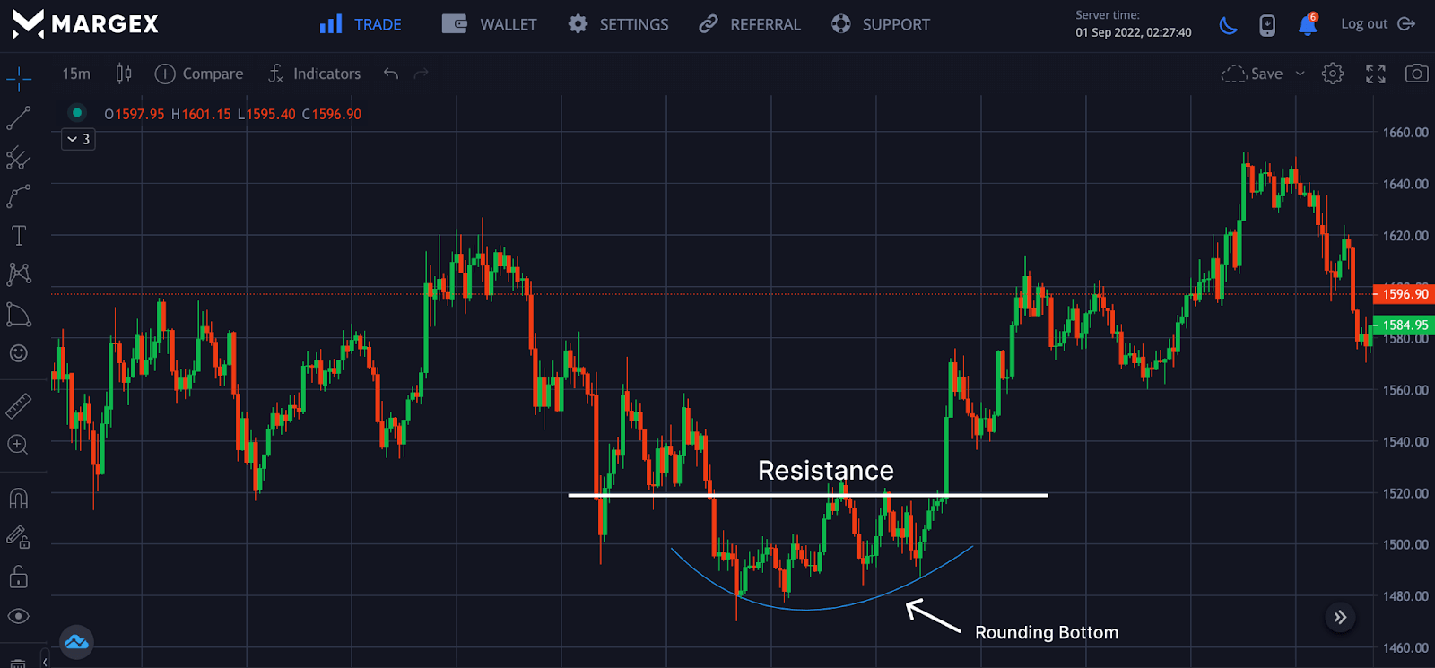
From the image, the price formed a rounding bottom signaling the end of its downtrend, and the price could move to higher heights. The rounding bottom consists of a neckline called the resistance; prices breaking out and closing above the neckline saw a rally to new highs.
Cup and handle
This is a bullish chart pattern that occurs regularly in financial markets. Cup and handle patterns are continuation patterns usually represented looking like a bowl with a handle after a period of consolidation. The cup and handle bullish chart pattern is slightly complex and occurs more frequently in a low timeframe.
The handle looks more of a consolidation, liken to a bull flag; on a successful break, prices would rally to a new high. Traders would need to take a position during the consolidation phase of the handle to ride the trend on the breakout.
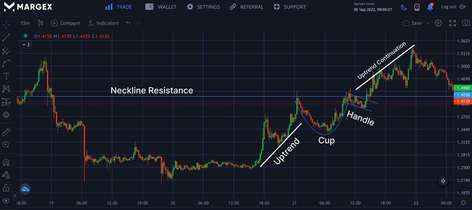
The image shows an uptrend followed by a cup with a “U” shape and the handle, which is the consolidation looking like a bull flag; a break above the cup shape called the neckline resistance, the price rallied to a new high.
Ascending triangle
The ascending bullish chart pattern is also known as the rising wedge or triangle; this is one of the most commonly bullish trends traders anticipate during a market continuation in the direction of the trend.
Ascending triangle a usually made up of trendline support holding off the price from going lower and resistance holding off price from going higher. Traders usually wait for the breakout of this pattern as it is 90% accurate most times. The bullish pattern completes its formation when the price breaks out of the ascending triangle and the price retests the resistance for high heights in price.
Sometimes it is possible to see an ascending triangle in a downward trend signaling the downward trend is ending. A break below the ascending triangle could also mean the end of the upward trend or a trend reversal is imminent, and traders must play with caution.
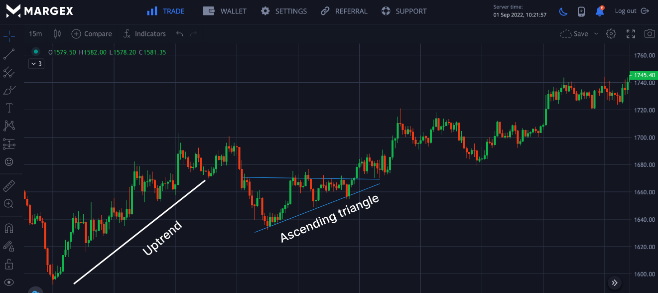
The image above shows an uptrend followed by an ascending triangle indicating a minor sell-off in price as the price goes into consolidation. A breakout and retest of the ascending triangle saw price continuation to the upside of the chart.
Aggressive traders or beginners take positions inside the ascending triangle before it completes its formation; this could lead to loss. It is best to wait for the breakout and retest before entering a long position, as this assures better profitability.
Hammer
The Hammer candlestick is one of the most employed patterns in technical analysis by traders in the forex, stocks, and crypto markets. Traders, most times seeing the hammer anticipate price reversals for either a bullish or bearish price trend. When a hammer bullish reversal pattern is combined with other proven technical tools or indicators can prove unmatched to help traders spot good entry or exit points for a long or short leverage position.
Hammers have a small body made up of opening and closing price with long wicks ⅔ of the body size.
The hammer is represented in the marked rectangle with price rallying above it. Hammers are also seen as demand zones as prices bounce off from these areas to new highs.
Inverted Head And Shoulders
The inverted head and shoulder pattern is the reverse of the head and shoulder pattern commonly seen at the peaks of price movements. Inverted head and shoulder patterns are easy to spot as they usually appear at the end of a downtrend, signaling a reversal could be in.
The technical analysis indicates the baseline of the peak, known as neckline or resistance.
This bullish pattern appears on all timeframes and allows traders to enter an uptrend price movement.
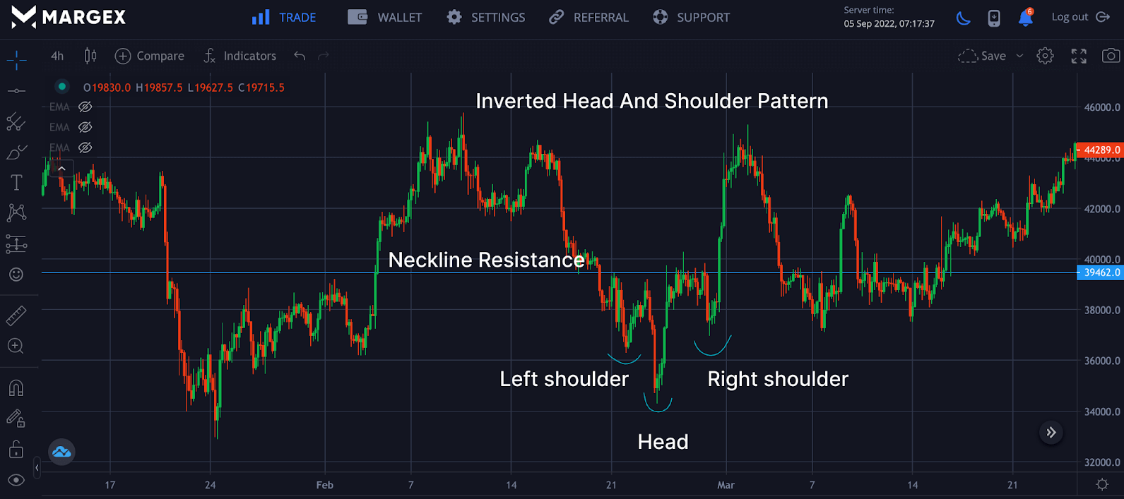
On successful breakout and retest of the neckline, the completion of the inverted head and shoulder pattern is considered completed. Traders and investors can open a long position as the price of the crypto asset have a high chance of reaching new highs.
V-Shaped Reversal
As the name implies, the V-bottom or V-shaped reversal comes up as a result of price action or momentum moving from aggressive selling positions or orders to an aggressive buying position or orders. This trend reversal pattern requires more caution and patience to break above the neckline of the V-shaped price.
During the V-shaped reversals, there is usually high volume in a downswing and followed by an upswing in price; an aggressive trader who lacks patience could incur losses trading this bullish reversal pattern without waiting for the retest of the neckline as prices tend to collapse in the financial market not completing the pattern.
The Piercing Pattern
The piercing pattern is a bullish reversal price pattern that signals the end of a downtrend or a potential reversal is imminent. The piercing pattern forms two candlesticks, a bearish candlestick followed by a bullish candlestick. The bullish candlestick closes slightly below the bearish candlestick.
This price pattern can prove challenging and give false signals; trading this bullish reversal pattern with indicators and other technical analysis patterns would give better assurance of high profitability.
The appearance of the piercing pattern at support is a good strategy as this would be a good area for the price to bounce off. It would be ideal to exercise a measure of risk management while trading these patterns by setting stop loss in place to minimize loss of funds as the market is very volatile.
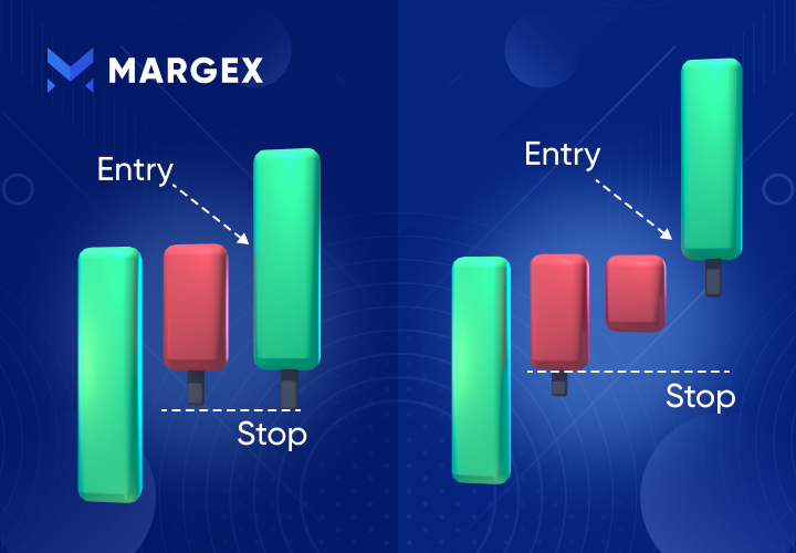
Bullish Engulfing
The bullish engulfing pattern is one of the most widely used price reversal patterns most traders come to identify before other advanced patterns.
This is a price pattern that appears at the end of a downtrend and can be identified by a bearish candle being engulfed or covered by a bullish candle signaling a potential change in price momentum. For example, in the four-hour (4H) timeframe, a bearish 4H candle is being engulfed by a bullish 4H candle.
A bullish engulfing pattern represents a change in downtrend sentiment, and traders can go long or buy the crypto asset on a breakout. Aggressive traders buy immediately on spotting this bullish pattern, while the more conservative traders would need more confirmation like breakout and price retest.
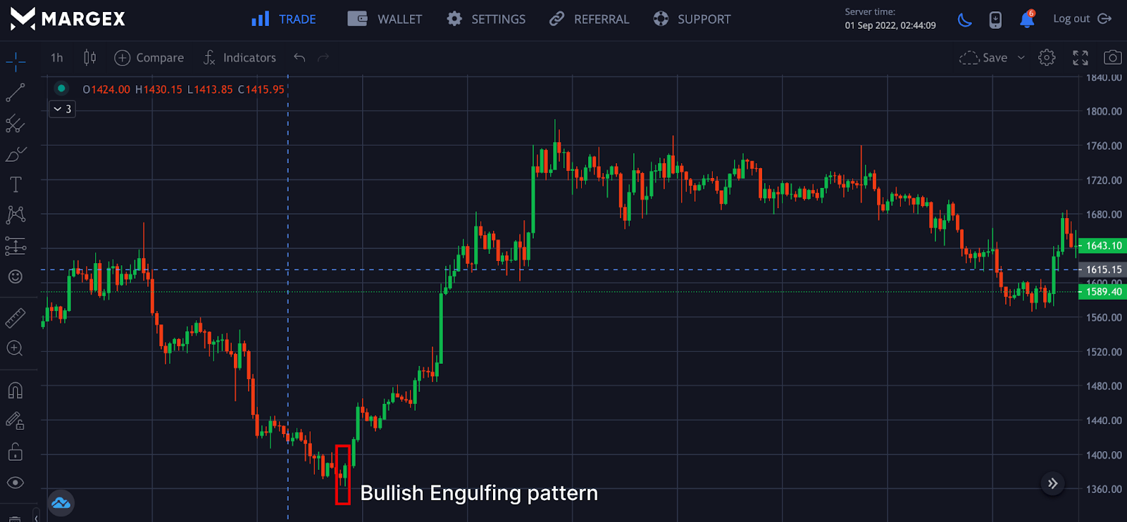
On confirmation of the bullish engulfing price rallied with more bullish strength and retested previous lows. The price of ETHUSD continued its bullish trend creating higher lows confirming price reversal, and traders could look for opportunities to go long.
The Morning Star
The morning star is a vivid bullish price pattern that can be seen at the end of a bearish downtrend signaling the potential end of the downtrend. The morning star consists of three candlesticks with the potential for price reversal.
Spotting the right reversal pattern is crucial for profitability and positioning yourself as a trader to ride higher trends.
The morning star bullish pattern consists of a bearish candle, indecision or Doji candle as many would call it, and a bullish candle.
The appearance of the Doji candle allows the bulls to take hold of the market or price movement, a bullish candle after the Doji candle shows a bullish trend reversal confirmation.
The Three White Soldiers
The Three white soldiers is another strong bullish candlestick pattern used to spot a potential price reversal. This bullish price pattern consists of long body candlesticks that follow each at the close of previous candlesticks. It should be noted that this candlestick pattern lacks long wicks rather than a whole body candlestick; a wick appearance invalidates this price pattern.
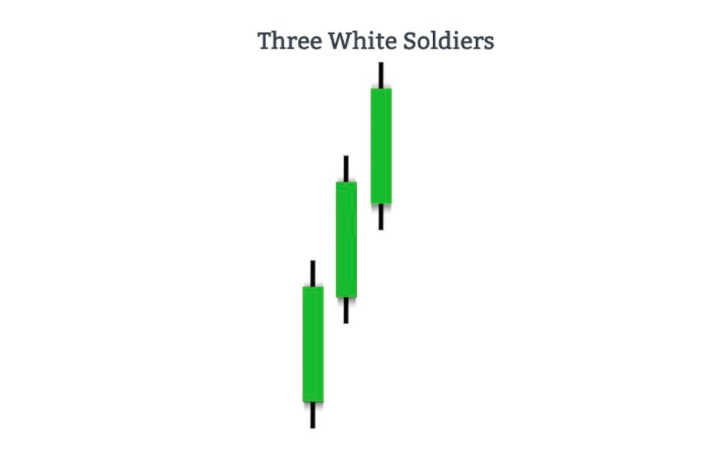
It has the following characteristics:
- Three green candles in a row with a broad trading range
- The candles are about the same size.
- The candlesticks have small wicks at the top and bottom.
- The second and last candle lows cannot fall below the previous day's midpoint price range.
- Each candle's opening price is within the height of the previous candle's body.
- The second candle's closing price exceeds the first candle's high.
- The third candle's closing price exceeds the high of the second candle.
How To Trade With All Of These Patterns On Margex
Margex, a Bitcoin-based derivatives exchange, allows crypto traders to trade various crypto assets with up to 100x leverage.
The Margex’s user interface is designed to make trading simple for beginners, and some of its built-in features are designed to help traders become more profitable.
- There are no additional charges or costs.
- The user interface was created with the goal of making deposits and withdrawals as simple as possible.
- Margex allows you to change the leverage of your open position, you can adjust or change your leverage as a trader.
Additionally, Margex provides a unique feature to trade while staking as this gives you the opportunity to make passive income considering how volatile trading can be.
If you have a Margex account, you will have access to these new features and technical analysis tools, which are built with real-time prices to help you make money trading.
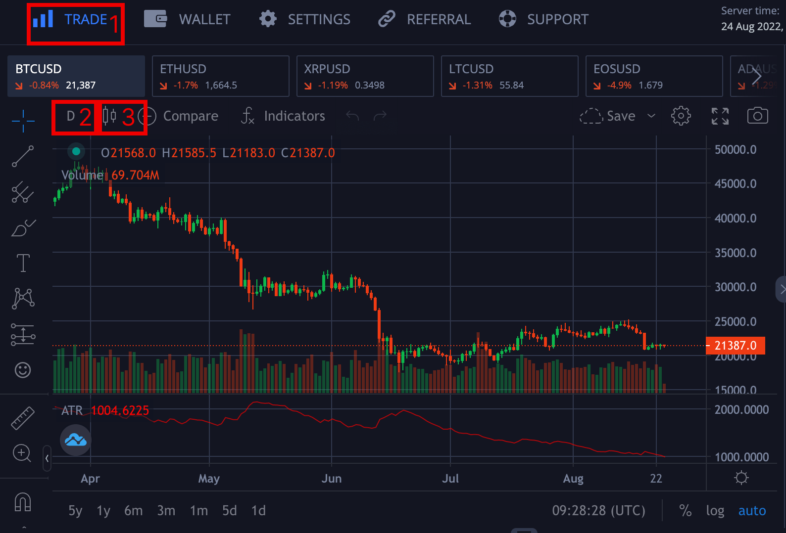
- Trade: Click labeled 1 to access the trading interface where you can make all technical analyses.
- Timeframe: Click on the labeled part 2 to switch across different timeframes based on your strategy and what appeals to you as a trader.
- Candlestick: Click on label 3 to switch from line to candlestick chart if you are a new user and have never used the technical analysis interface.
FAQ
There are a lot of unanswered questions about trading bullish chart patterns and how to use them. This section of the article focuses on the questions you want answered.
What Is The Most Bullish Chart Pattern?
There are several bullish chart patterns, but triangles are among the most popular chart patterns used in technical analysis because they occur more frequently than other patterns. The three most common types of triangles are symmetrical triangles, ascending triangles, and descending triangles.
What Are Bullish Patterns?
Bullish chart patterns are technical analysis patterns or tools traders use to spot a potential change in the downtrend. Bullish patterns help traders to position themselves to ride massive uptrends and spot good entries and exits of price movements.
How Many Bullish Patterns Are There?
There are so many bullish patterns that technical analysts adopt for better profitability. The bullish patterns mentioned above are very common among traders and, when applied with other strategies, would lead to more investment returns.
What Is The Most Successful Chart Pattern?
A bullish chart pattern, when used well with other technical patterns, would b more successful depending on the market price actions. Based on market conditions and preferences of each trader, there are chart patterns that could be more successful for different traders.
Which Is The Strongest Candlestick Pattern?
The bullish engulfing candlestick pattern is considered one of the strongest patterns for price reversal in a downtrend. It is easy to spot and can be successful when combined with other strategies.
How Do You Read A Bullish Chart?
A bullish chart is formed when there are successive higher and lower lows or swing highs as prices continue progressing in an upward trend or momentum.
Is Bullish Buy Or Sell?
Bullish refers to buying opportunity or a long leverage opportunity; this gives traders and investors the chance to open positions on crypto assets.
How Can You Tell A Bullish Trend?
You can tell a bullish trend when you see a chart formed with successive higher highs and lower lows or swing highs as prices continue to progress in an upward trend or momentum.
Can A Head And Shoulders Pattern Be Bullish?
The Head and shoulder pattern refers to a potential bearish momentum imminent, while an inverted head and shoulder pattern indicates a change in price sentiment from bearish to bullish.